label redesign
packaging 2018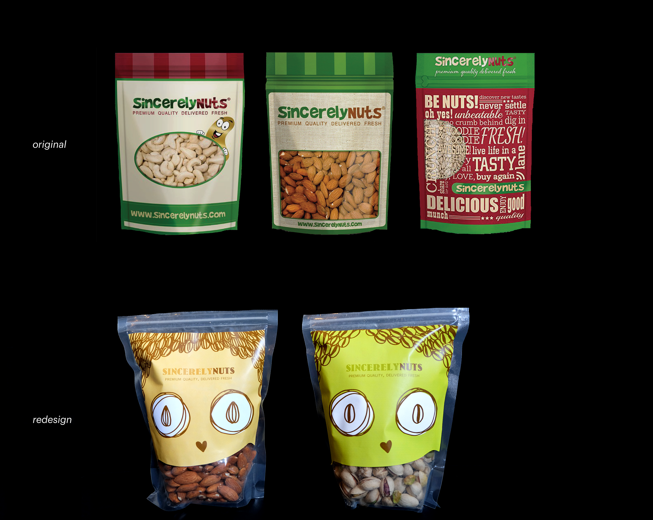
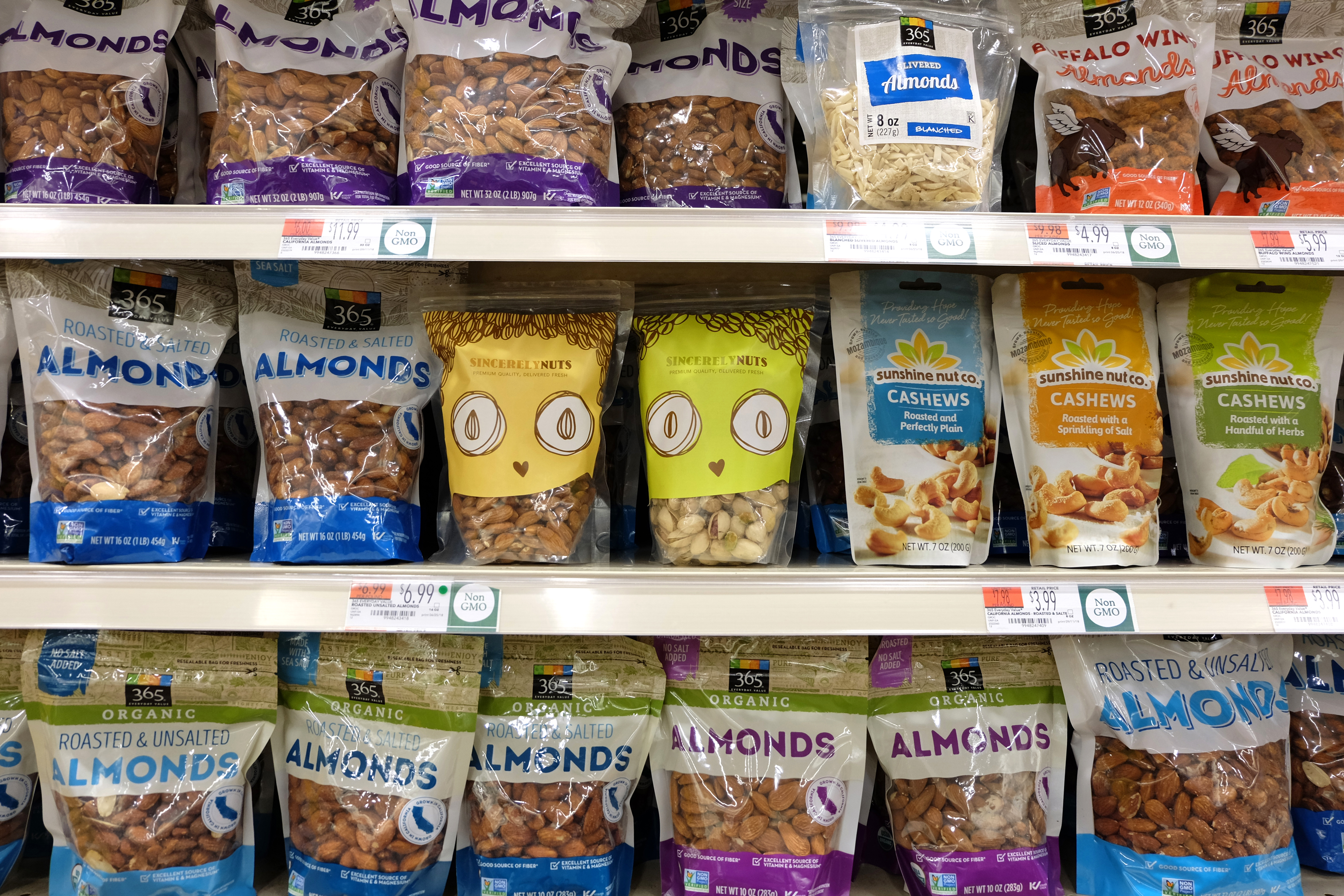
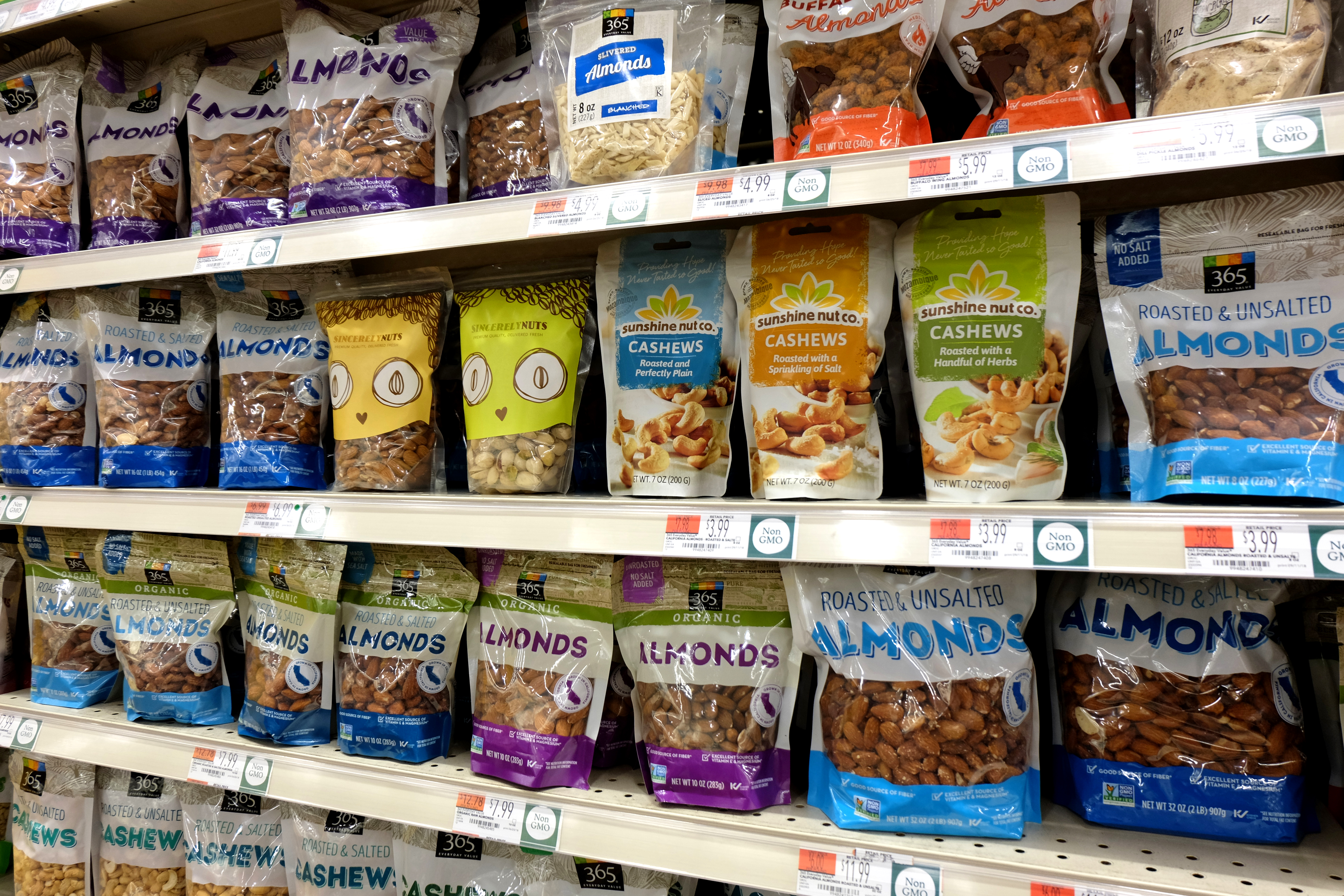
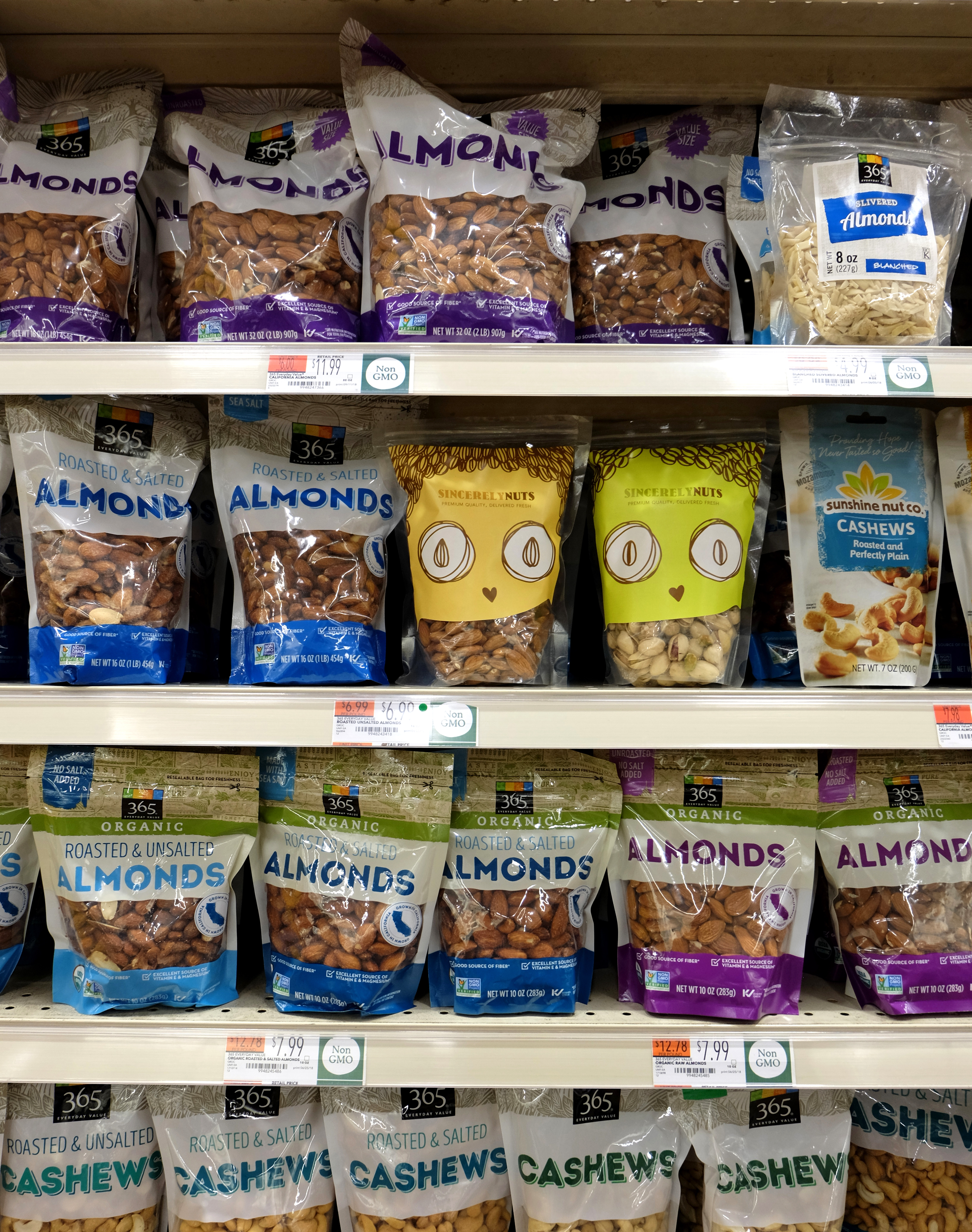
client’s brief
It is important to us that the labels show our products are
“premium quality, delivered fresh” in a clear and concise
manner. The color scheme and typeface may differ from
the current, as we have not yet settled on one consistent
identity for our brand. Our hope is that we can bring our
consumers the same amount of excitement we feel when
we gather together and have a good time enjoying our
favorite nuts.
design rationale
The goal of this redesign is to modernize the brand, and
present it to its consumers in a package design that will
appeal to their appetite as well as their visual senses.
The redesign preserves the client’s wishes in appealing
to a wide range of consumersand converting all to
become sincerely nuts about nuts.
color & type explorations

Instead of trying to tweak details of the client’s original packaging,
or give it a clean, minimalistic aesthetic, I decided to keep the
authenticity of the brand by clearly showing the product through
transparent packaging, but push the nuttyness to an extreme,
and make it absolutely nuts.
label redesign results